Charisma wanted a comprehensive rebrand to set them apart from the rest of their sector.
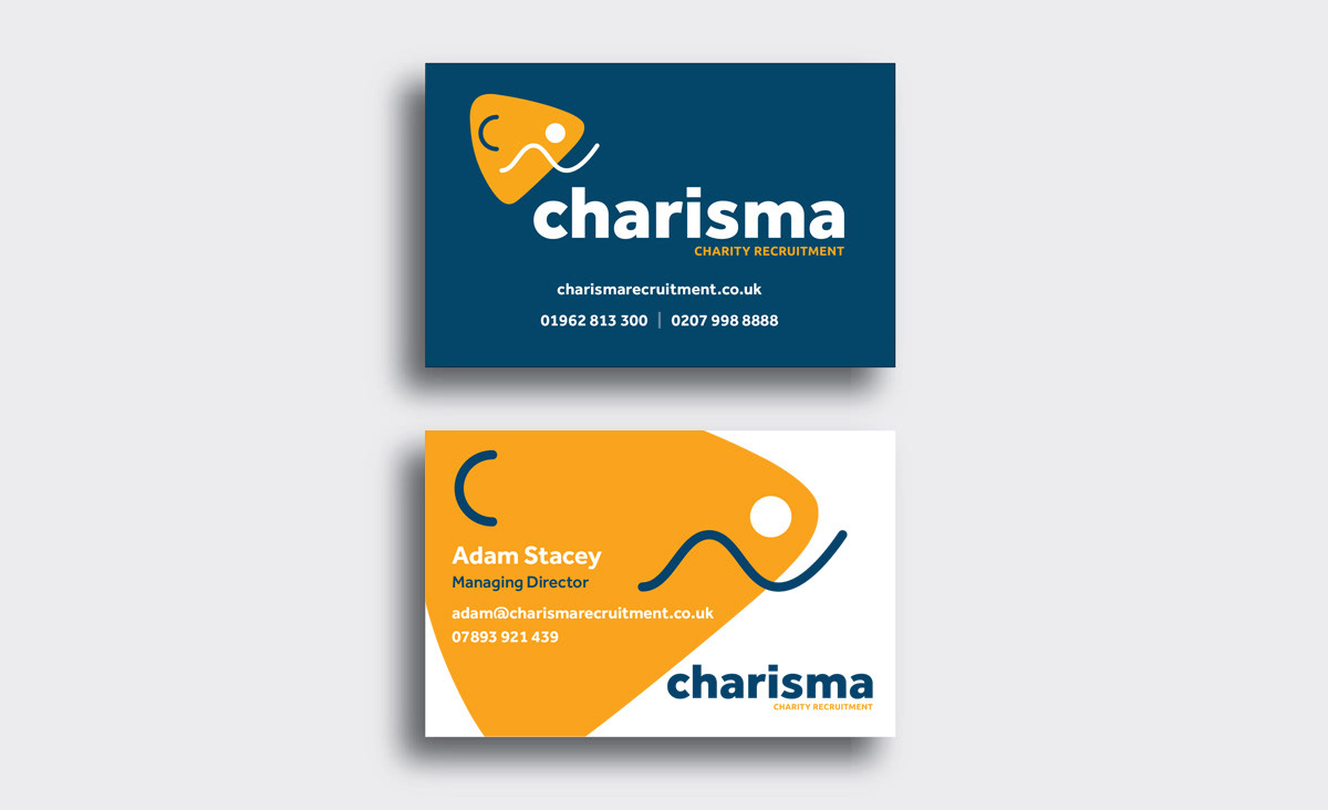
New brand elements were introduced, including a vibrant colour scheme, engaging and unique iconography, which in turn introduce a sense of fun and distinctiveness into their identity.
New brand elements were introduced, including a vibrant colour scheme, engaging and unique iconography, which in turn introduce a sense of fun and distinctiveness into their identity.
The revamped brand now resonates with the company values - that no two roles or candidates are the same. This transformation not only modernised Charisma's visual presence but also reinforced its commitment to fostering positive change in the charity recruitment sector.
Branding / Visual identity / Stationery

To keep the brand adaptable and interesting the graphic element is made up of four elements which can be combined in a variety of ways. Each team member gets their own graphic element which is applied to their business cards and email sign off.